BRANDING
REBRANDING & NEW PRODUCT LAUNCH
This part of my portfolio is the effort of a talented team I have the pleasure to drive and lead.
In branding I love the feeling when a beautiful idea is born from the chaos of what people want, what they need and what makes them tick.
Because let’s face it – a brand that doesn’t speak to the heart is just another pretty package.


LET`S DO IT!
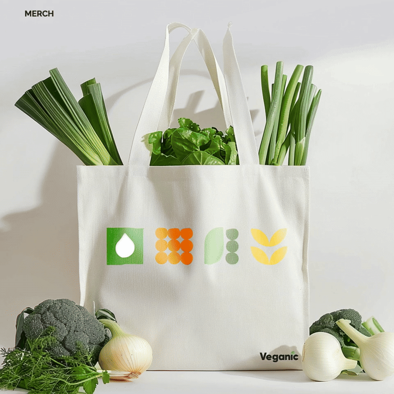
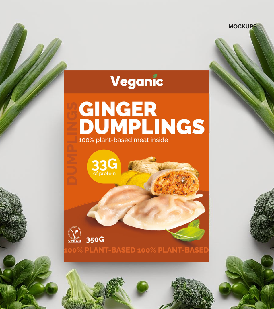
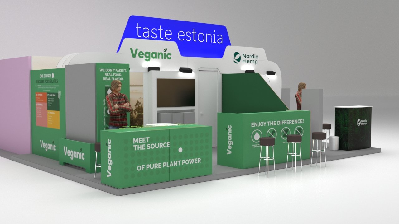
As a Head of Branding I led a fantastic creative team in the rebranding of a plant-based brand Veganic. The main goal was to prepare it for international markets and present the brand at SIAL Paris.
Additionally, we had to design a distributor's pack to showcase that we are ready to support our partners, offering all necessary digital and printed materials.

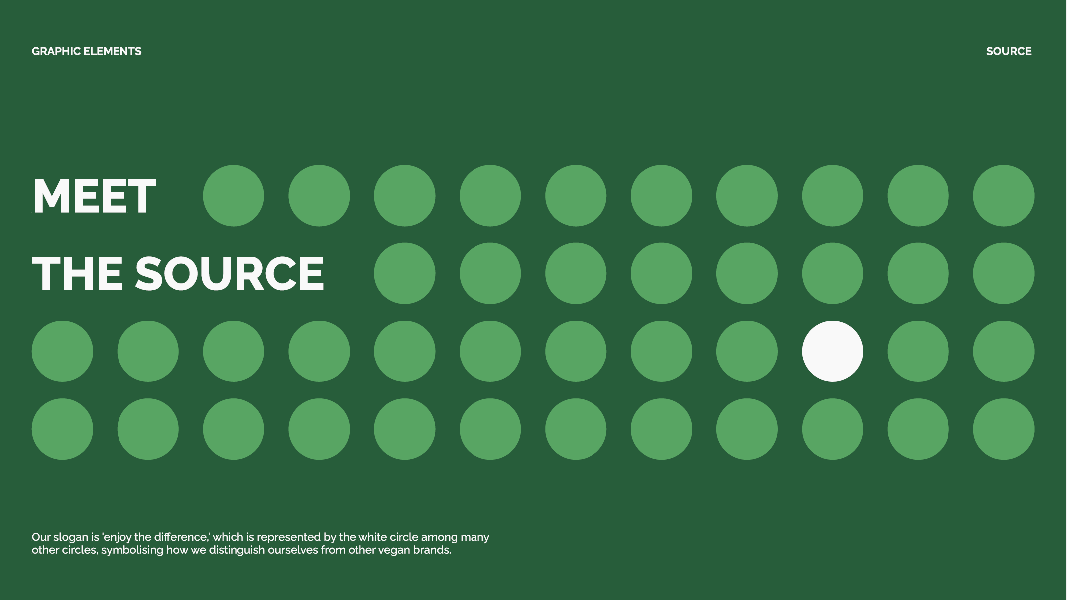
THE SOURCE
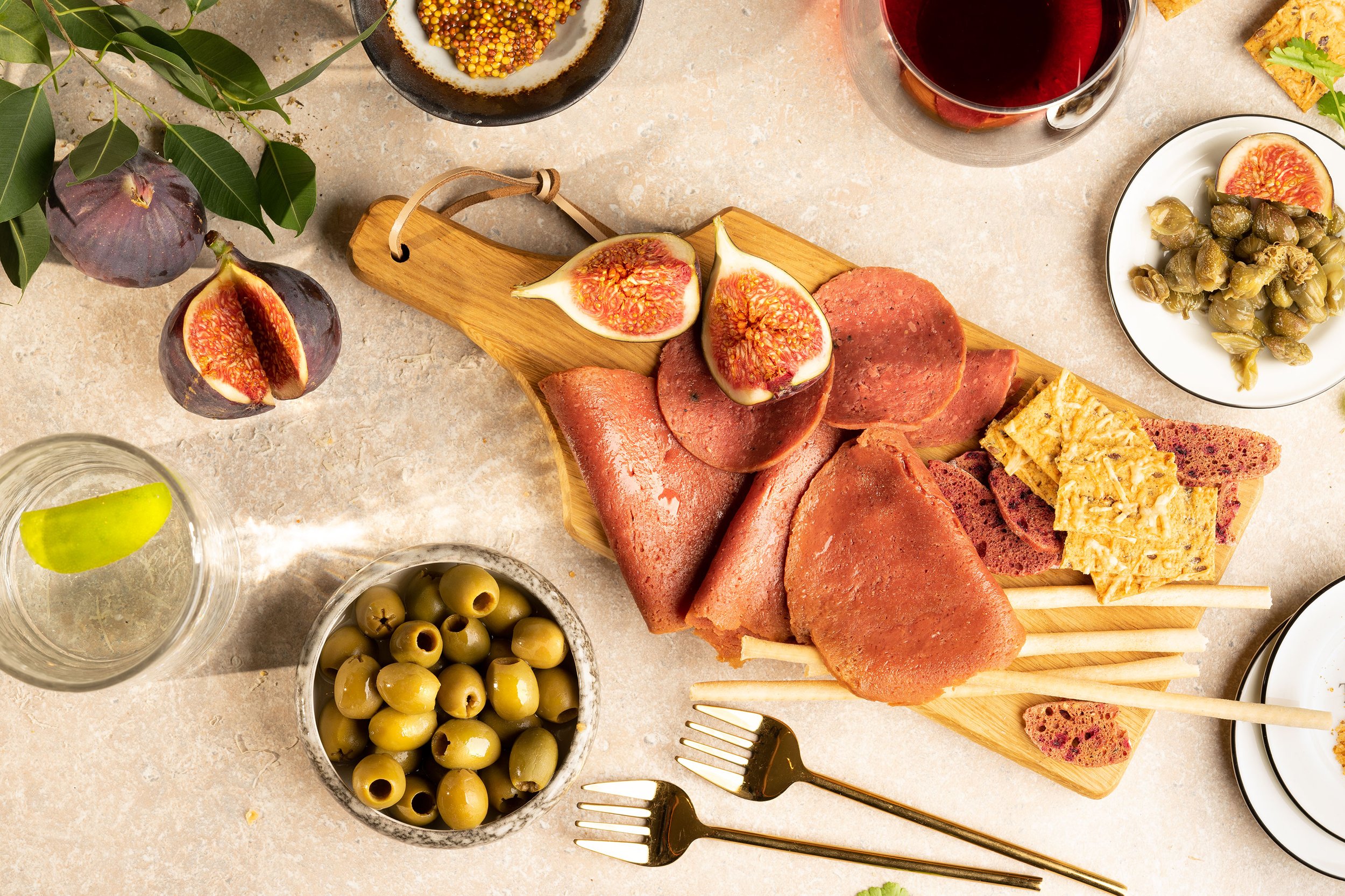
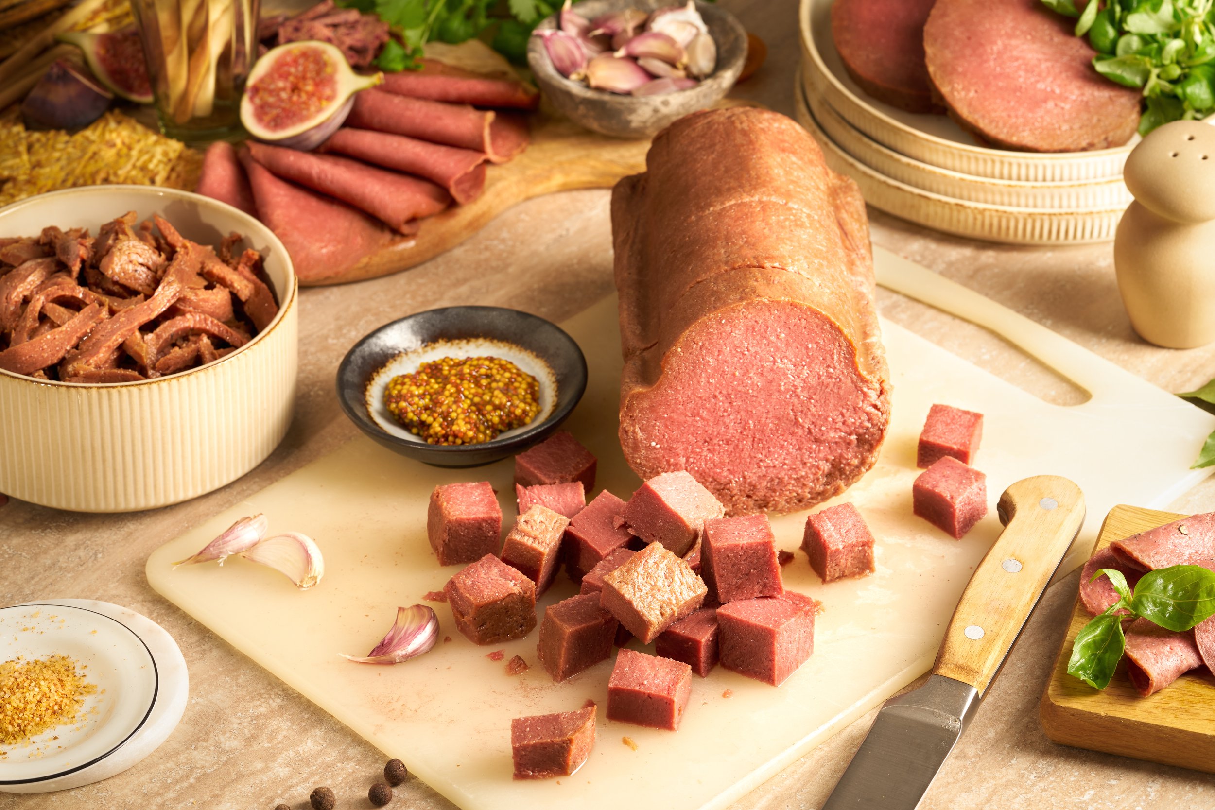
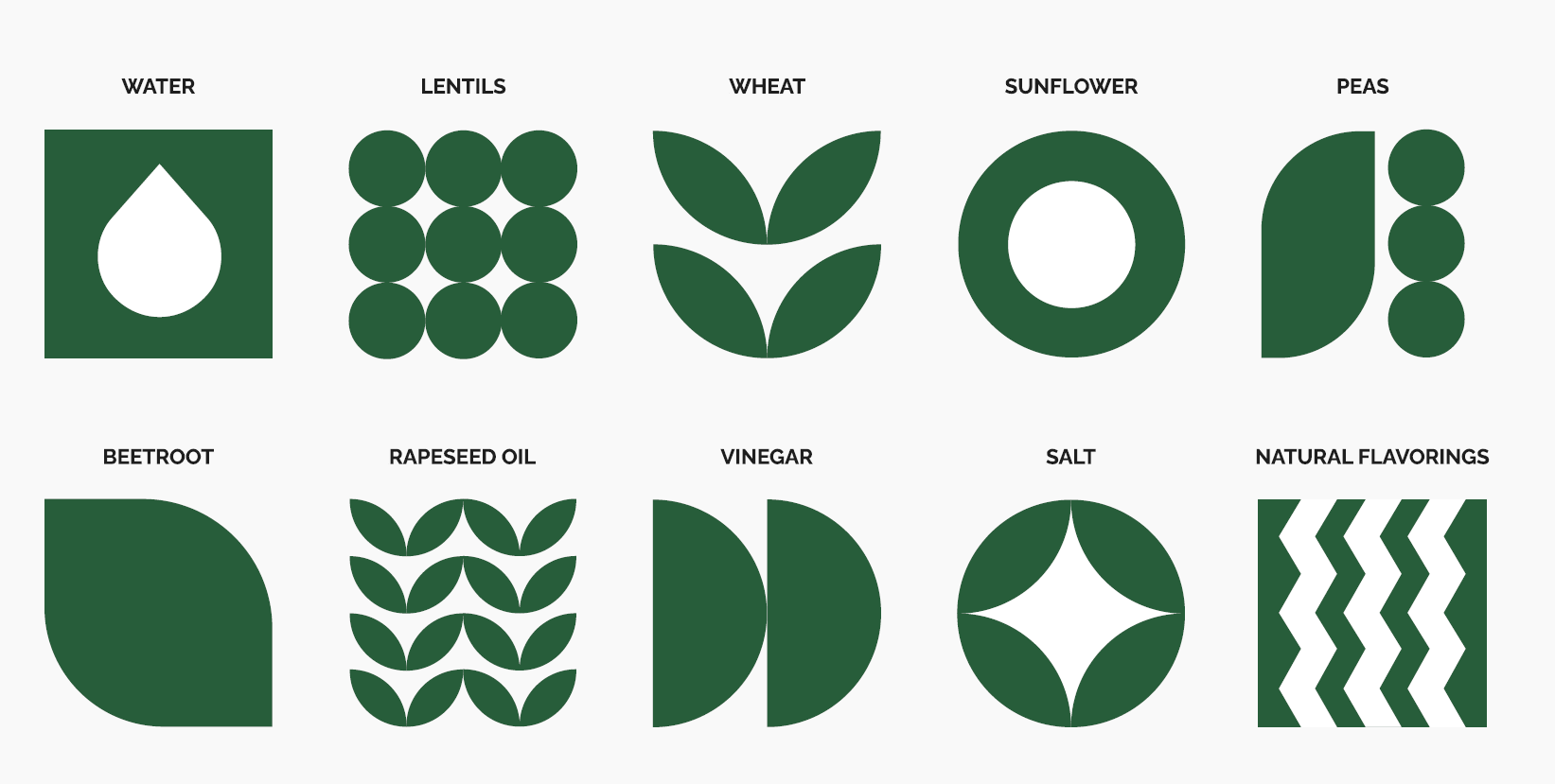
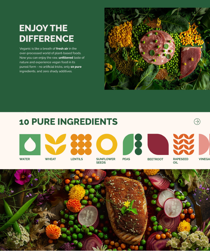
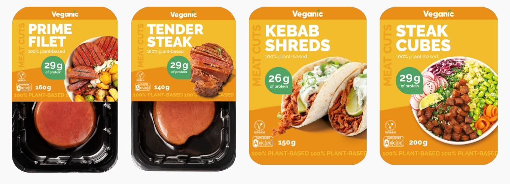
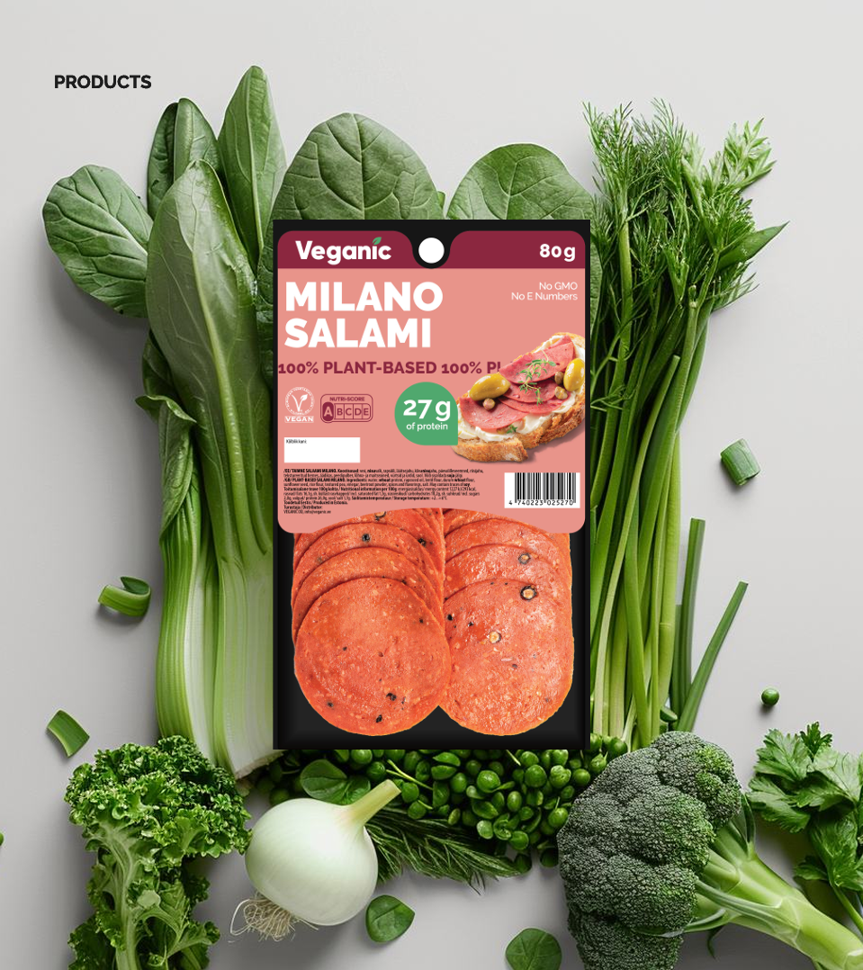
The old design was fine, but the color choices for product packaging lacked logic. We organized products into four groups and chose the perfect colors for each.

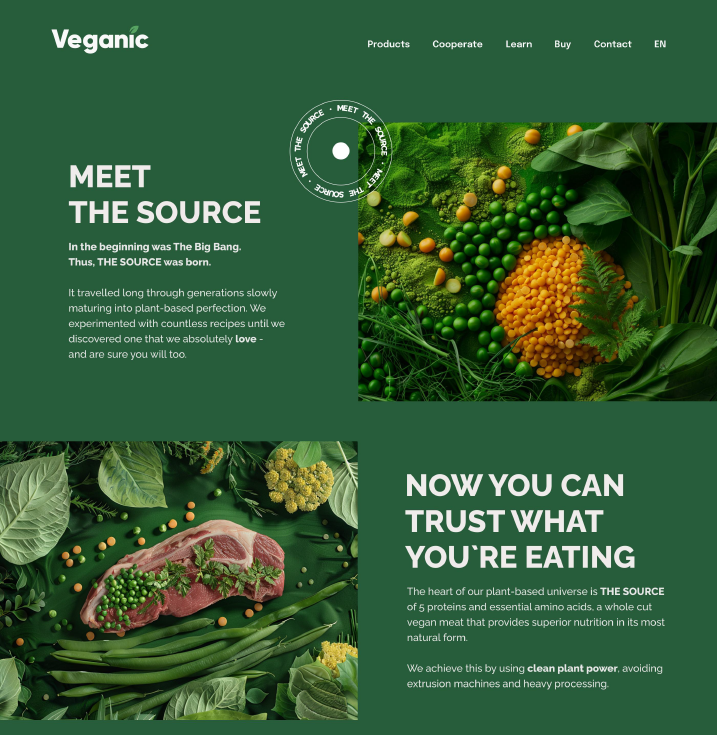
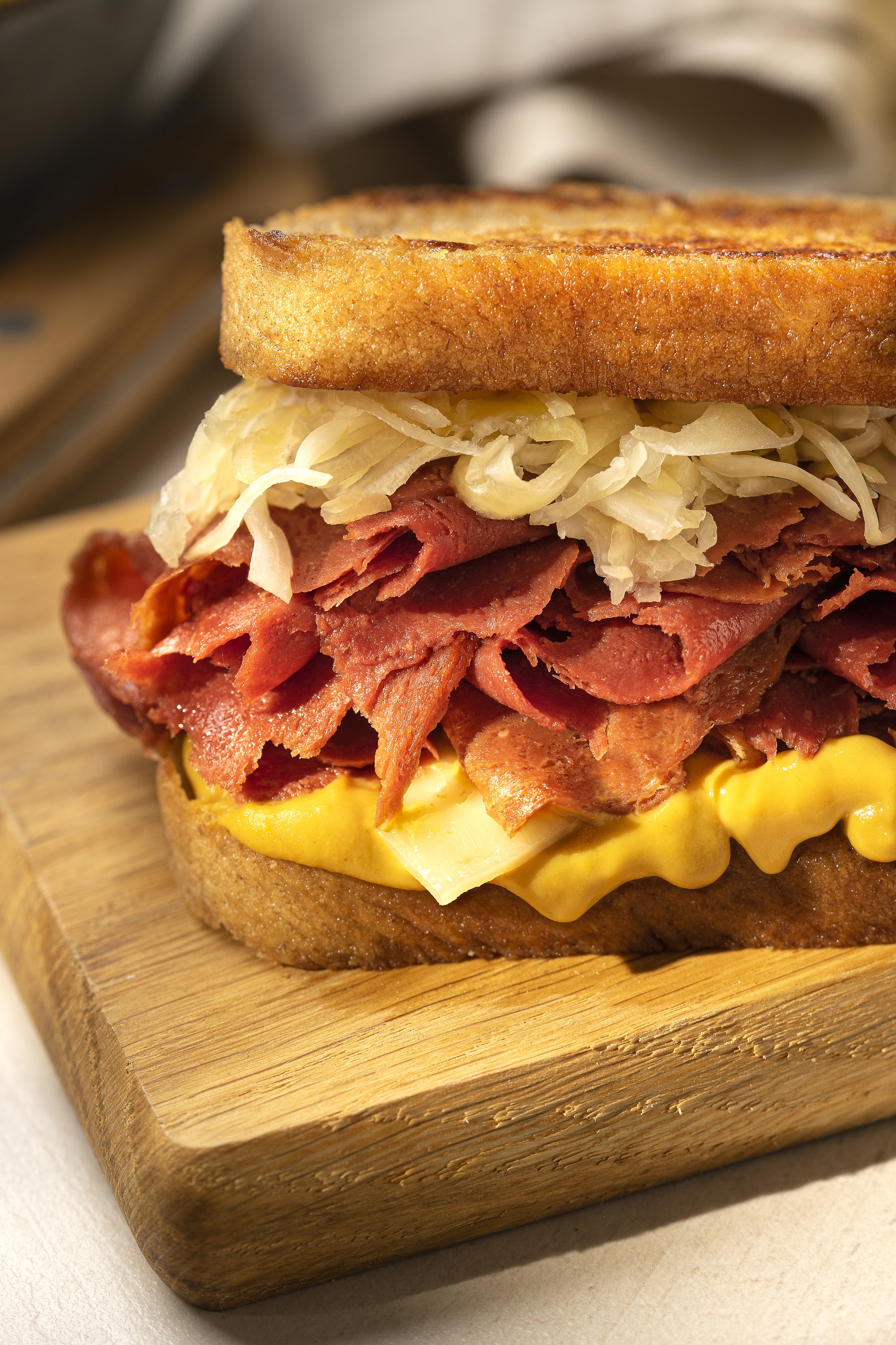
One of their most fascinating products? A massive 3-5 kg meat substitute with the oh-so-thrilling name "log," forming the base for other products. We renamed it "THE SOURCE" as it is the core of the Veganic universe.
RESULT?
EVERYBODY LOVES IT!
A new tone of voice, fresh visuals and a whole new vibe.
What are we most proud of? Our distrubotors and biggest retail chains love it just as much as we do.


THE CHALLENGE
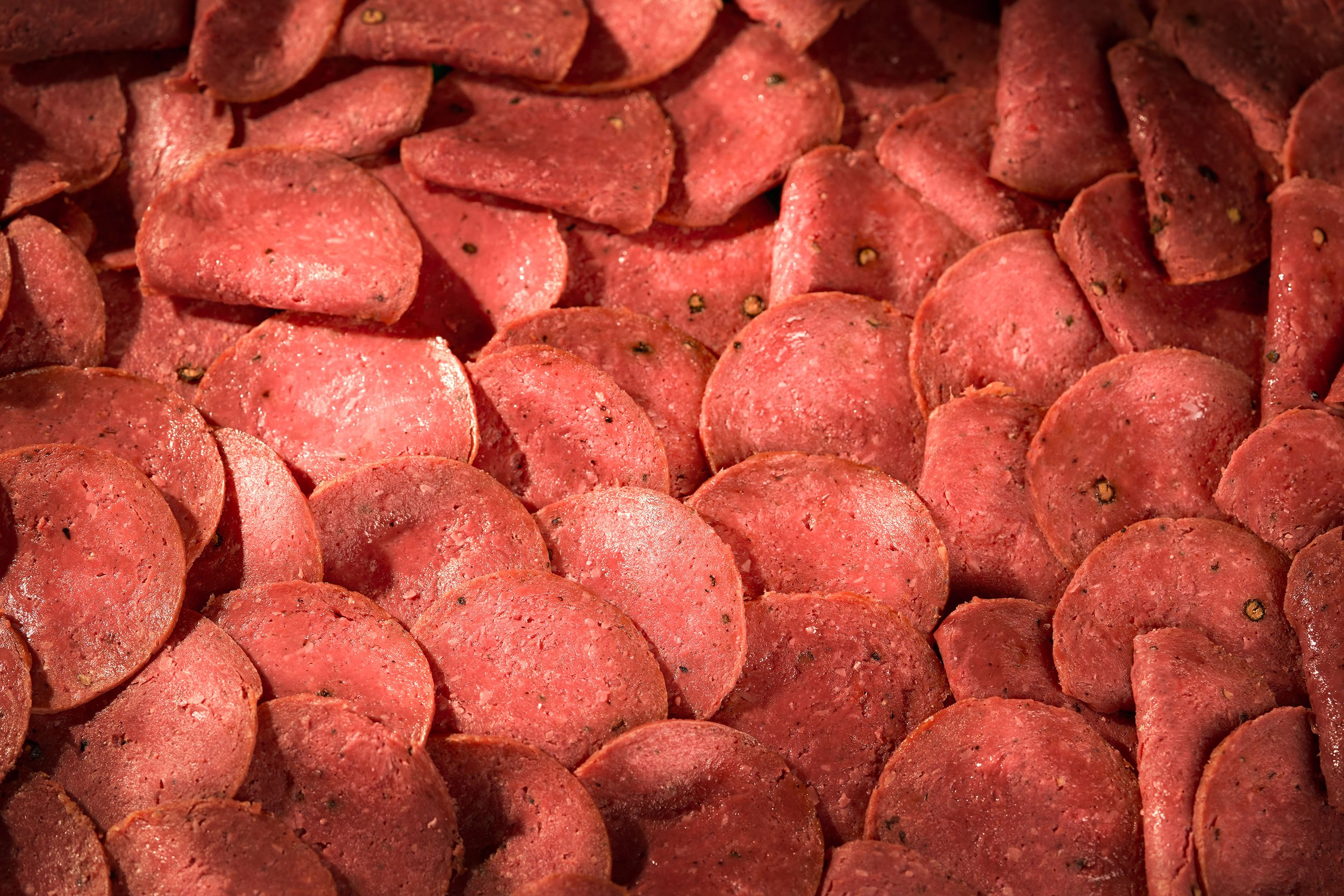
Some brands get boxed into a single product category in consumers' minds, and this was exactly the challenge we faced. Retail chains saw the brand as unsuitable for the BBQ product category, which limited growth opportunities.
As Head of Branding, I led the creation of an entirely new brand to break that barrier.
We came up with "Jüri Lihameister" – a name that adds a personal, real touch.

MARKET INSIGHTS
With around 30 products in various packaging formats, the first step was to structure the lineup and divide it into clear categories.
When design choices got tough, I did what I do best: field research. Customer reactions to products in real time showed me which colors caught attention and felt right.
In the end, we chose a vibrant summer-inspired palette of green, blue and orange.


THE RESULT?


The new brand reflects high quality ingredients with an eye-catching palette - a bold contrast to the usual reds and pinks of meat products.
Biggest local retail chains finally started adding it to their assortments.


GO DAUGAVA GO!
The company had two goals: launch a new line of healthy, low-calorie dumplings and chicken patties in Latvia, and boost sales. I led the creation of a new brand concept to make it happen.
We brought in hockey star Kaspars Daugavins, who loved both the product and the idea behind it. He was excited about the real value we wanted to bring and that the project had a social impact.


COLOR PALETTE
The colors and patterns, inspired by the Latvian flag and ethnic symbols, were chosen to bring out the vibe of national pride.
This choice reflects Kaspars Daugavins' role as Latvia’s captain at 2023 IIHF World Championship, embodying leadership and unity.
MORE than just food

With a warm heart at brands core, a portion of each sale is donated to the Latvian Ice Hockey Federation.
Now available in major Latvian retail chains, Daugava Line is scoring big both on the shelves and in the community.